Friday, 15 March 2013

Construction - Making the shots slip into the timeline and increasing or decreasing shot length. - Prince And I

During the construction and editing of our music video we decided to use final cut . Since no one in our group was a pro at using final cut it meant that some  of the effects that we wanted to use in our music video either limited or wasnt done at all. This for us as a group was destressful, knowing that this would hold us back in editing and then would bring down the overall quailty of our music video. Luckily we had final cut pros at our disposal via youtube on the internet. We found that most of the problems that occured, when searched on the internet or youtube could be easily overcome using the tutoriasl that were availible. this allows to learn tthe skills quick enough to apply them to our video without it looking shabby.

Here is one of the videos we used to help us with the editing:


From watching this short video you would probably have an idea of what type of problem we encountered during the editing. Well, on recording day where we went to shoot our videos we thought we had done a great job in terms of lighting, the song and...the lip syncing. But we were later proved wrong when we were exposed by final cut. We put in a clip into final cut and made sure it corresponded with the sound track and found that our artist had come out of lip sync or was too slow or too fast half way in a verse. This was a problem, a very big problem and with the deadline for our rough cut just days away and no time to record, we needed to find a way to overcome this problem. This is where the help of this video came in. We simply used one of the tools on final cut to speed up or slow down the video so that the lip syncing and the sound track went together!(Prince)

Here is how we did it: 
First i had to locate the problem or the part of the clip which i want to edit and either make slower or faster. When thius was done i highlighted/selected the part fo the clip. I then i went to "Modify - Speed"

This caption shows us moving the speed by increasing
the percentage.


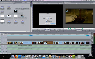
In this shot we had to move the shot within the created
timeline we had and then slow it down using
properties then speed. Thus tehn decreased the shot making it slowed and the overall shot longer or we could do the reverse. 


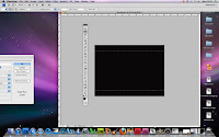
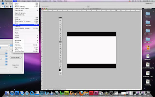
In this shot it shows us moving the black bars that we have
 created into the newly cut and shortened scene.
This was gragged acrosss the timeline which allowed us to
use it across the video without replying it in every shot added.


Monday, 4 March 2013

Album Cover Research - Melanie Fiona And Others - Sath

To begin creating the digipack for our music video for the song 4AM, we needed to look further into digipacks. The best place to start was by looking into album covers for the artist Melanie Fiona as she is the artist of the song 4AM.


Melanie Fiona's fist album was called 'The bridge', it was released in 2009. The album cover for the album consists of a close up of the artist's face, the picture seems to be a side portrait shot with Melanie facing the camera but looking past it to the right. It gives us a sense that she is looking back at something which could be her past. The photograph is presented in a grey scale format and shows a lot of the shadows in the picture. There is very little highlights shown but gives there is enough which helps define the face of the artist as well as parts of her hair. There is also a white spotlight on the wall behind the artist which goes with the colour scheme of the album cover which is black, white and grey.


Melanie Fiona's next album was called 'The MF life' and it was released in 2012 which is a three year gap between her two albums. At first sight when you compare the two album covers, you can notice that her second album cover has a lot more colour than her first album cover. In this album cover, the picture is a long shot which shows a side view of her leaning down against a lamp post. The picture is taken on a sunny day and has a lot of bright colours as well as a purple heart in front of the lamp post. Since this is titled the MF life, i think that the warm bright colours and the atmosphere of the picture is shown to put across the nature of Melanie's life and her personality.


The next album cover i am going to be analysing, is the album cover for '4' by Beyonce Knowles'. I chose to analyse an album cover of Beyonce, as she is another R&B singer and that is the genre of music that 4AM is from. For this album cover, the colour scheme consists of black, yellow, and pale green. The black and yellow is shown using Beyonce in a medium shot showing her with both of her arms over her head. The idea of Beyonce having her arms over her head, it looks as if she is relaxing without any care for what she is doing. She is shown to be topless with a long black furry coat hanging over her shoulders to cover most of her torso but leaves her belly showing. There is a lot of golden jewelery used in this album cover, it is used to show the wealth and status of Beyonce as she is a well paid artist.


The next album cover i will be looking at is for the album 'Talk that Talk' by R&B singer Rihanna. This album was released in 2011 and was the singer's sixth studio album. This album cover consists of a close up of the artist's face. She is shown wearing an sleeveless top with a lot of eye make up and lip stick. She is also shown sticking out her tongue which shows us the nature of Rihanna and her personality in the album. There is a big 'R' on the top left hand corner of the album cover in grey which is used to represent Rihanna. The album name is written on the wrist of artist almost making it look like a tattoo which helps it blend into the photo and makes it look natural. 

Monday, 25 February 2013

Construction - How The Black Bars Were Made (Jessica)

Before we started to gather together our footage we had to start getting the basics down first. So when we started to construct our video we started with the black bars, our base for the entire video.
In order to make our music video look more professional, as well as give it a cinematic look; we decided to add black borders. The black borders we made simply in Adobe Photoshop. 
Firstly I opened up Adobe Photoshop and name our PSD file as Black Border (easy, simple name). I then set the width to 800 pixels and height 1200 pixels. Making my PSD this size means that rather than trying to find the exact measurements of the borders; it would be easily to use the crop tool and alter the size as much as I would want. 
Once I have set all the necessary details I clicked on the ok button and proceed onwards. As you can on the right all the preferences I set gave me a vertical rectangle white box. Next I needed to change the colour of the rectangle box to black before I can alter the size of the PSD. To do this I simply used the bucket tool selected the colour I wanted which was black then clicked on the rectangle box and it changed to black. 
Next (using the crop tool) alter the size of the PSD. Using the crop tool I change the vertical rectangle to a horizontal rectangle - by making the rectangle horizontal it would fit much easier into our music video. As you can see on the picture on the right I stretched the crop tool across the rectangle box until it touched both ends and then pressed the enter button; now it looks like this:
After I had made it the size I wanted it to be, I then used the select tool and made it wide enough to make sure that on either size there is an equal amount of black left out. I made sure the amount of black that I left out was too skinny, in order for me to be able to play around with the size in Final Cut. Next using the CMD + X ( command and X keys) I cut out the selected part of the rectangle which gave me a white background.
Finally I have made the black borders which will give our  music video the professional, cinematic group. When I was finally satisfied with the look of the black borders, I went to file - save as.
I made sure that I saved the black border in a easily place for me to locate later in Final Cut, I also saved the PSD file as a PNG; this ensure that the white part of the rectangle will not appear on the video,

Saturday, 23 February 2013

Evaluation Question 2: How effective is the combination of your main product and ancillary texts?

For our question question 2 we were asked to look at the effectiveness of our project as a whole. I feel that looking back at our combination of our main and ancillary tasks we were creating an highly accurate piece of media which was aimed perfectly at our target audience.


                    "We have chosen this song for multiple reasons. Firstly we think that the bat   and the lyrics of the song show exactly what the R&B genre has as some of its stereotypes. Secondly, we think that this is also a good example of an R&B sing without rap within it. This would allow us to use as many of the R&B conventions to make our video successful in its field. Thirdly, this song contain an emotional, hearty vibe to the song, making us able to tap into the protagonist emotions of the current situation. This would help us greatly when picking the narrative and how it should be portrayed. However it also has a vixen edge to her tone of voice, this will enable us to use darker colours for hair, wardrobe and make up."

My  Audio Script:


Here is the script that I created before I decided to make my audio.


I decided to display my answer in video format:

When we were looking at project we wanted certain things to stand out as effective. Firstly, it was house style. when we first embarked on this project we realised that it would be so much easier to link to two ancillary tasks together, however it would be more difficult to link either to the music video. I believe that is when we took image and house style more seriously and moved our research from secondary to primary as well as moving planning to extensive, detailed analysis into convention which sculpted our planning. When looking at house style we wanted to make that we showing her feminine side, highlighting female dominance and girl power often suggested in R&B music videos. On top of this we had sure that this was used throughout the project such as props during the video being used in our photo shoot for the album cover and poster.
For example, in our music video even though she was in her boyfriend's clothes she was,ain't in two very feminine outfits showing off her figure and her sexuality.
The house was continued into the digipak by using the colours black and pink, con notating mystery, sex appeal, femininity and reaching out to the younger female audience with some lighter shades of pink.
As you can see we used the shades in pink in our rainbow face builder effect for our first attempt to create a album poster as opposed to the light pink we used in the font when creating the first attempt of the album cover. In our final edits however, we decided to make it more mature, appealing to the older generation of our target audience, engaging both men and women.
 The effectiveness was evidenced by the feedback we received of the digipak by both social media, showing our research into the older category of our target audience as well as our younger viewers.

VS.             
Both these responses show that the house style was incredibly effective giving the target market a sense of realism as well as creating an effective promotional package for the artist through shown in our colour schemes when comparing both the music video and our ancillary tasks.
Our research and extensive planning was shown to be effective when we asked a member of industry to take a look at our promotional package and he had this to say;


He highlighted that our research and planning was proven not only useful but essential as he helped us see how our work looked and had the structure of an actual music video and he said he was surprising impressed with the attention to  detail such as the icon and the black bars as well as the introduction and the titles. We felt that we also spread this highlighted use of professionalism through to our ancillary task by adding existing magazine reviews on our album poster and record label icons onto the back of our album cover.


Friday, 22 February 2013

Evaluation Question 1: In what ways does your media product use, develop or challenge forms and conventions of real media products?


1. In what ways does your media product use, develop or challenge forms and conventions of real media products?
When we were asked to do a music video it was important that we discovered and fully understood all of the forms and conventions of music videos as well as the genre that we were going to go into. As we were learning them me began to understand why they were so important if we wanted to create a realistic and successful music video which would reach out accurately to our target audience.
Firstly, we have to make sure that we made sure that we knew exactly what kind of music video we wanted to portray and that we knew what kind of conventions we wanted to keep
'R&B videos usually have the performance within the narrative, merging perfectly both story lines'
and also have to acknowledge and have alternatives for the conventions that we were going to challenge.
Our Research On Our Target Audience's Forms And Conventions

Our first shot I decided to annotate is our establishing shot 0:11

I feel that when we were creating this shot to wanted to apply the emotion that would be shown throughout the 
of message we wanted to give our viewers when being introduced to the video such as; 
"what kind of emotion do you expect? and Who side will you take throughout the video?" 
We wanted to make sure that we were showing same emotions that Melanie did in the beginning of the original video.
Our use of camera work during this shot was an off side shot which showed her in her supposed 'natural' state as well as having it in a mid close up which identify us with the protagonist straight away so we can start to develop a relationship for the artist.
The lighting of the establishing shot was low because we wanted the video to look like it was set in the middle of night, supporting the lyrics of the song "4AM". if it was 4 am in the morning if would be dark and we wanted to show. although, our overall wasn't as successful because even though we capture the darkness and the natural light.
The music played during this shot is slow and has a string instrumental which fits the slow panning during the shot.
During this shot she was in her boyfriend clothes, showing the emotional link that she has the clothing. She is also in her room, an intimate place where it would be appropriate to express feelings.


I thought that this shot was similar to the establishing shot in Sean Paul's 'How Deep Is Your Love?' as you see him staring away from the camera while the background is setting the scene, gearing up for the song. The mood of the song is also similar as you can see the sombre attitude of the both the protagonists. the mood almost mirrors the mood in Tanks' 'I Cant Make You Love Me.' this is shown by both their facial expressions but by the darker scenario, hinting at the viewer the type of song this might be.


The second shot I decided to annotate was 0:24

I feel that the extreme close up of the phone was not only a convention of our music video but a general convention of most music videos and are often seen in them to give important information such as a get together or ending of a relationship.
I feel when we were creating the shot we wanted to apply this general convention, showing the relationship that the two of them have. moreover we were trying to subvertantly display the type of relationship they have between the two of them. In the shot see notices then skips over her contact, trying to avoid contact with her. The kind of message we wanted to give to the viewers was to question the relationship.
Why is he avoiding her calls? Why doesn't he want to talk to his girlfriend? Is he guilty of doing something wrong in their relationship?
Our use of camerawork during shot was an extreme over the shoulder shot, showing the name of his girlfriend. This allowed the viewer to get a glimpse into the characters life, with the P.O.V shot allowing the viewer feeling that they are in this situation with the characters because of how close you are.
The lighting of this shot was one of the most well lit shot that we have in the entire music video. The background needed to be well lit so that we are fully aware that we are in a different location to the last shot. The phone itself had to have been put on the highest light settings so that we can see the screen as clearly as possible. This allowed us to have such as a good clear shot of the contact. 
The music played during the shot was the slow first verse describing how badly her boyfriend behaves towards her. The shot almost mirrors her suspicions in some ways.
During the shot there was a a simple extreme close up of the prop of the mobile phone, which was placed in the middle of the screen. This was essential in getting the shot so that it's relevance stood out among the other shots.


This is similar the the mobile shot in Jordin Sparks and Chris Brown's 'No Air.' Both shots showed the phone receiving a call and going over a contact and responding to the phone call. in our video they responded negetively, by going over the contact. however and this video they responded more positivlely by answering the call.


The third shot that I decided to annotate was 1:04

In this shot we decided to follow the conventions of the R&B genre, where the protagonist, usually a female artist does a take of her looking directly into the camera displaying all her emotions. We wanted to full embody this wen we took this shot, showing the pain that she is going through while her boyfriend doesn't have a care.
When we were creating this shot we wanted her emotions to stand out more so the white background gave nothing to focus on except her, while on the other hand we subverted the opposing emotions shown by her and her boyfriend; his carefree attitude to her emotional draining state. The message we were trying to give to our viewers was to pity her for what she is going through.
Our use of camerawork during the shot was a direct close up of her face, full displaying all the emotions and allowing the viewer to see clearly what she was saying with the song. We also decided to use a projector over the camera to give a vintage effect as well as to give a dramatic shadow. we felt that this allowed the video the have both drama in the acting from our protagonist, drama within the lyrics of the song and I feel we delivered a dramatic backdrop.
The lighting of the shot was well lit and had the projector adding extra light to make it a bright contrast to the dark night time scenes of the first verse. The background of the shot made it seem more bright because it was so plain. This allows the audiences to concentrate on what was being said by the artist.
The music played during the shot was the dramatic chorus, highlighting her emotions of her boyfriend current whereabouts.
"It's 4 am and my lover wont answer!" 
During the shot there was a close up of the protagonist singing behind a projector back drop. We felt that when we were filming this we wanted use use the idea of projecting your feelings literally. she was dressed in her boyfriends clothes (The baggy checked top) because we wanted to suggest the emotional bond that she still had with her boyfriend even though she knew he didn't feel the same way.


This shot is similar to the shot shown in Keyshia Cole's 'Enough Of No Love'. Both protagonists look straight into the camera, showing great emotion and showing a predominantly female audience girl power and asserting female dominance. The emotion is similarly captured to the shot in Tank's ' I Cant Make You Love Me' showing how he connects with the audience through felling and expressing the lyrics in facial expressions.


The fourth shot I decided to annotate was 1:11


In this shot we again decided to follow R&B convention which is exclusive mostly to rap infused songs. This is where they are payed by an drink company to show their product. This extremely popular in today's music and it has actually influenced song lyrics in some cases. we wanted to embody this to show the realism behind the promotion and the business side behind making a music video other than exposure for the artist.the is the perfect example of intertextuality in the music industry.
When we were creating this shot we also wanted to make a statement that it is placed in the video just after the chorus and the shot shows it being slammed onto a surface, in a forced front view of the camera. This can also be seen as links to lyrics when she refers to "Pour me up a drink I swear I need it"
The use of the camerawork during this shot was an extreme close up of the bottle of wine. When filming we made sure that it was far enough for the viewer to identify what the product was (the wine) and close enough to read the brand, fulfilling the company purpose if they were to do themselves.
The lighting in the shot was extremely clear as it had to be if we wanted to make this shot readable and professional to the public. The shot was also in a natural setting but was brightened in editing in order for our shot to look as good as possible.
The music was during the chorus of the song which we used during editing to suggest its importance in it being there even though the shot is only 1 second long. In the music industry it has been proven that the promotion by other is essential if we want to present intertextuality in our video.
During the shot mise en scene wasn't really important as long as the product was clearly and primarily shown.The bottle of wine was placed in the center of the shot and was emphized by slamming down motion.


We actually did a post about the inspiration the shot and the popularity it has within the music industry as a whole as shown in the Advertisment During Music Videos Post.
This is mainly seen these days in rap videos where they show off bottles of ciroc, a popular drink that is often sponsored by rappers. It was originally owned by P Diddy so many rappers felt the need to support. This is like in Rick Ross video 'Diced Pineapples' where he places the drink, next to the cup full of diced pineapples in center shot on several occasions.


The fifth shot that I decided to annotate was 1:20

In this shot we decided to challenge the conventions of an R&B music video convention by adding something that fitted with the music but was delicate, contrasting with her passionate but hard and forceful feelings. We wanted to challenge this because we felt that we could add something different but still be pulled off as dramatic.
When creating this shot we wanted to create a statement so we decided to show a common convention of love (The rose) and and visual image of it being lost and it drowning (The bubble filled bathtub). We also thought that this could be seen as mirroring the feeling in her heart of her drowning in unrequited love.
The use of camerawork during this shot is mid shot of the bathtub and a rose bud being dropped into a bubble and rose petal filled bathtub, creating splash effect. It was further zoomed in and slowed down to give it clarity. we felt that we needed to capture its surroundings rather than just the rosebud because then it keeps the delicate/dramatic balance.
The lighting in the shot was well lit because we needed to capture the many details in the shot such as the bubbles and the individual rose petals put into the bath before the rose bud. We also made sure that there was an extra spotlight on the motion to make it look more professional.
The music was just after the chorus in the second verse which meant that the tempo of the song had slowed down enough was just to get the motion in time with the music.
During the shot the mise en scene was important because the placing the the rose petals around the place where the bud would drop without ruining the original set or the fluffy bubbles.

The sixth shot that I decided to annotate was 1:48

I this shot we again tried to challenge the conventions by adding a focus pull for and intro to the second verse. we wanted the motif of a clock showing the time had to be impressive so that it didn't look cliche and that it captured the slow pace of the song by carefully following its speed.
When creating this shot we wanted the visual moving from one focus (the protagonist) to the time 4am (the clock)   the transition had to be done carefully as we wanted it to be as professional. we also had another shot of a clock later to reminded of the time.
The use of camerawork was a wide screen mid shot of all the character and the clock. it panned across the screen, following in the eyes of the actress before closing up and the focusing on the time being shown, 4am. the slow zoom made the clock more central to the shot. the placing of the shot had to be exact as the timing can make the shot more impressive.
The lighting in the shot was well lit at the time to make sure that we had the clock in good view, considering the time day. But in editing we added the blue screen to make the 'night time' effect more authentic. We also made sure that we had the kitchen light on to add more natural light from behind the camera.
The music in the shot was the transition between the verses, adding more effect to the beginning of the second verse.
During the shot there was the setting of the kitchen and the clock being par central before the camera moves it to central focus. The prop was shown to be the most needed because it was making the message in the shot.

The seventh shot that I decided to annotate was 2:20

In this shot we went back use the conventions of the R&B genre by having a mid shot of the artist in a plain color background, usually black or white, singing form a profile view. This shot is used in many female singers in the industry and is often used for an effect of showing the shadow act similar to a ying yang painting.
When creating this shot we made sure we got thew balance between the location background and the plain white wall. The person placed between was aimed to be dark so that we only got the portrait of the person. Her actions during the shot were extended, which allowed the the shot to look different to other videos, making our video stand out among others in the industry.
The use of camerawork was a wide screen mid shot of the protagonist singing at an angle from the white background. We made sure that there was enough room for her to move around in and that she could play with her movements during this take of the second verse. This was also evidenced in..........
The lighting in the shot was low because we wanted the portrait to be in full effect and to clearly stand out among the other shots, especially the front view shots. in addition to this we added our own blue lamp light to add a different dimension to the shot.
The music in the shot has a beat that drops every 5 seconds. this allows us to add our transitions more easily and locate them more accurately for effect. The music at this moment takes the natural slow pace of the song which makes the long take acceptable.
During the shot the mise en scene rely on the costumes. as well as the background taking the portrait pose and the placing of the person adding our own twist by he pose, her clothes were also adding to it as they were monochrome with a statement necklace to stand out as well as the bright red lipstick and nail varnish.

This is often shown in the industry in music videos such as Usher's 'Make Love In This Club', where he is seen to have an intimate moment with his companion who he is trying to convince her to sleep together. We wanted to capture this intimacy towards the viewer as well as showing the desire for the intimacy she craves from her partner.


The eighth shot that I decided to annotate was 3:19

In this shot we decided the use the most basic rule of convention in the R&B genre. This was a shot of the intimate close up with the artist face. this is used in nearly every single video in the genre because it links the audience with the artist and the emotional subject that they are talking. this is usually the case with R&B.
When taking this shot we wanted to show the full effect of the projector by her shadow. We also wanted her emotions to stand out more so the white background gave nothing to focus on except her, while on the other hand we subverted the opposing emotions shown by her and her boyfriend; his carefree attitude to her emotional draining state.
The use of camerawork during this shot was a direct close up of her face, full displaying all the emotions and allowing the viewer to see clearly what she was saying with the song. We also decided to use a projector over the camera to give a vintage effect as well as to give a dramatic shadow. we felt that this allowed the video the have both drama in the acting from our protagonist, drama within the lyrics of the song and I feel we delivered a dramatic backdrop just as the second shot I annotated.
The lighting of the shot again is similar to the second but we like the fact that it was lighter because it showed the transitions of her emotions and the change in clothes.
The music played during the shot had a drum and base base and dded the change to rest of the song. We felt that this reflected the shot well as the change that we wanted to display in her feelings for him.
The mise en scene reflected in this shot showed her change in clothes and make up to look more attractive and noticeable this could be reflected in the lyrics
" I don't deserve this life, I'd make the perfect wife."
and her desire to be treated right by her boyfriend.
We also wanted to make the viewer sit up and realize these changes.

Again these shots are similar to Rihanna's ' We Found Love' as they use the projector effect to show her feeling and to add a sense of intimacy. Also in Ciara's 'Sorry' the projector scene was used to create a performance scene like ours.


The ninth shot(s) I decided to annotate is 3:44 to 3:47 and all the reverse shots

These are all reverse shots that we have on our film. these are often seen in R&B genre music videos because it shows the importance of the action being done and the reverse represents the regret in the action being done in the first place.
We used this in our video to apply the message o the lyrics in the song and the theme of love lost. we used this action to subvert the idea of regret, similar to other videos but we have the actions and their reverse separated by the turning point, the arrival of the other girl at his house.
The camera work of these shots were similar to shot 4 & 5 and were simply reversed.
During these shots the mise en scene were important as they were the only focus point and we felt that the reversal of this was highlighting this.  


This effect is shown well and gave us inspiration in Marcus Canty's 'Used By You' where he displays the braking of the glass bottle and the putting together again in the video. We used the effect for the pouring and unpouring of the wine showing the night she wanted in comparison to the night she got.


Friday, 15 February 2013

Ancillary Tasks - The Album Poster

Here is our ancillary task: The Album Poster

Ancillary Tasks - Digipak

This was our first option for our album cover


And this was our second attempt and and our eventual final piece

This is our digipak